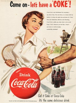
The ad is a full-page image magnified vertically. On the foreground or header, there is a message in bold black and red saying: Come on-let's have a ‘COKE’! The coke, written in caps, is embraced in single parenthesis, followed by an exclamation mark. Much of the image space is occupied by a young, beautiful, white woman with a pretty smile. Her red lipstick resembles the red color used as part of the header and the Coca Cola logo. Her hair is a dark auburn color which is like the brown Coca Cola drink in the bottle next to her on a table with a white tablecloth. The young woman is wearing a white shirt, with a few buttons in front of her chest, tucked into a white skirt suitable to play sports in. In her right hand is a tennis racket which is almost covered behind her body. A hairy man’s hand, with a brown watch on it, is holding the woman’s other arm. She is looking at him with that beautiful smile on her face. Covering her waist, is a huge red Coca Cola logo sticker with text written in bold white color.
In the background, behind the woman, is another pretty, young woman in white, playing tennis with her racket. The umpire, a man in a suit sitting in a brown highchair, is looking at her. In the top right corner, just beneath the header, above the playing woman and umpire, and adjacent to the main woman’s head, is a message typed in small black words. It emphasizes how Coca Cola is a refreshment for everybody, at any time of day. No matter where you are or what you are doing, it is always the right time for a Coke. They call it pure and wholesome, delicious, and refreshing.
Finally, the message says to enjoy Coke whenever you feel like a break, emphasizing the drink is a real refreshment. In the foot of the ad is a short message written in black, but bigger in size than the previous one. It addresses the naming convention of the drink. Whether it is Coke, of Coca Cola, it is the same delicious drink, The purpose of this ad, which is a 1950s Coca Cola ad, is to inform people about this amazing product. It is trying to demonstrate the idea of a fulfilling life associated with the product.
The target audience is white, well to do, and working-class people, especially young men and women who might have been interested in sports. Given it was the 1950s, white people were the ones who could afford the leisurely lifestyle and luxury shown in the ad. The white man’s hand holding the woman’s shoulder signifies how young men and women were going out to meet in these places. Sports and recreation were for interesting people, and the idea of Coca Cola being associated with that would appeal to a lot of young men and women who might have wanted to be seen as interesting, having a great life.
The bold red and black header is eye catching, and attention grabbing. From the moment the reader sees this ad, their attention falls to the header. The ‘COKE’, in bold red and all caps makes the name stand out from the rest of the message. The pretty young woman’s image appeals to most men. Her red lips, parted in a bright smile match the Coca Cola logo and are also enticing. Her dark auburn hair resembles the color of the drink itself making it memorable through association. Since her hair is unforgettable, the drink will not be forgotten as well. The small, typed words are placed strategically next to the woman’s pretty face so that the reader will not miss the message. The words suggest a refreshment no one would want to miss. It encompasses a broader audience by stating that one can have a Coke anywhere and anytime of the day, whether at work or play.
The use of white clothes, white tablecloths and a white background promotes the brighter colors of the drink and brand. The only thing not in white is the umpire’s chair but it too is brown, like the color of the drink. Placing the red Coca Cola logo in front of the woman’s body highlights the logo since people naturally are drawn to look at the woman. The strange man’s hand holding the woman’s shoulder is enticing to man who see her smile as warm and welcoming. It makes people want to go out more to meet the opposite sex, and once they do, they must get refreshments. In that moment, they remember seeing this ad about a drink that is refreshing. The man’s watch is also brown, which is coherent with the color of the drink.
Much of the image is occupied by the young woman to attract the attention of the targeted audience but the Coca Cola messages are strategically placed all around the woman so that people can subconsciously associate the product to the pretty woman. In the end it gives them a good feeling. One day when they see the drink, it will bring back the feeling they had when they saw the ad and prompt them to buy. The ad is of a good-looking woman and there is a higher probability it will be shared between friends, colleagues, and neighbors. This way the product becomes popular, and people know there is Coca Cola, The use of keywords like pure, wholesome, and delicious shows how diction and syntax is exploited by advertisers. These words are specific and convey the message as quickly as possible. The word wholesome for example, brings a wholesome feeling to the reader and is reassuring.
Finally, the size of the drinks themselves is minor compared to the image of the woman. The advertisers are not trying to suggest people to buy, but they are hiding things in plain sight. Using this suggestive trick, next time people see a coke they subconsciously think they are the ones who thought about it. Everyone feels good about feeling like they are in control. Advertisers let buyers feel this way by hiding minute details in plain sight.